
A Neighbourhood Café Reimagined.
In the heart of Amsterdam, Koepelcafé has long been part of the neighbourhood. Located on the corner next to the Renaissance Hotel, it feels open and connected to the city around it.
The goal: bring back the authentic café atmosphere and transform it intoa warm, accessible meeting place for locals, visitors and hotel guests alike.And so, wedeveloped a renewed concept for Koepelcafé, combining rebranding with interior designto restore the charm of a classic Amsterdam corner café.
'Timeless character, thoughtfully brought forward.'
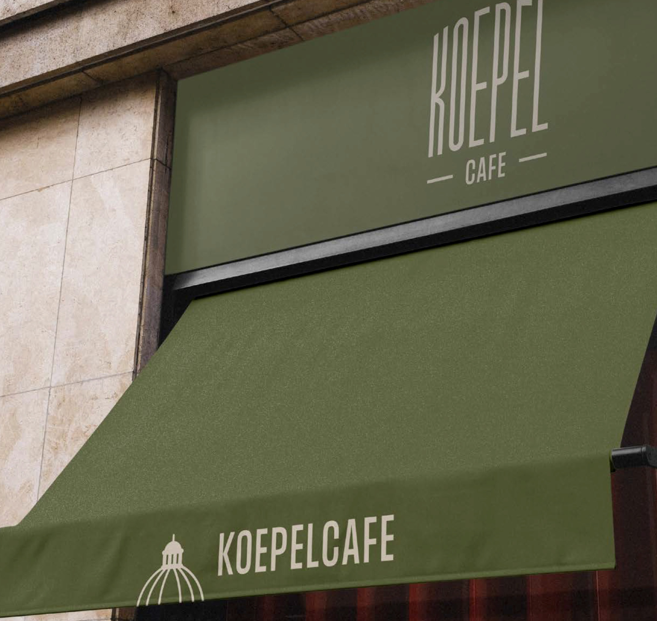
The visual identity takes inspiration from the nearby Koepelkerk and the historic neighbourhood of Kattengat. The logo stylizes the iconic dome while referencing the narrow streets leading to the café entrance, creating a graphic identity that reflects both the architecture and the sense of discovery of the location.
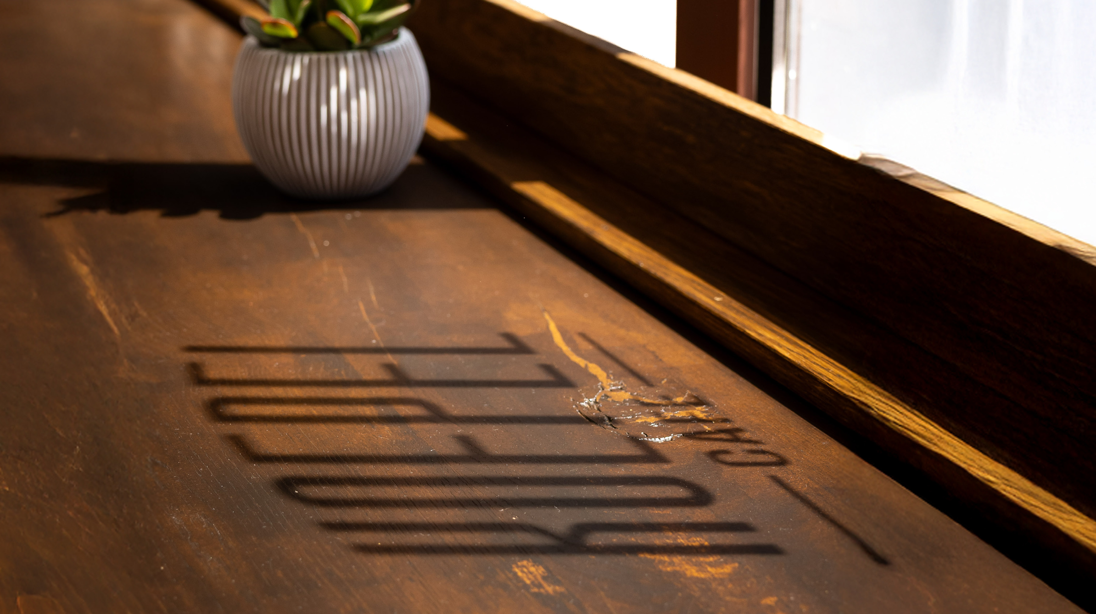
A warm and earthy colour palette, tactile materials and refined typography bring a sense of heritage and understated elegance to the brand. These elements translate across menus, signage and in-café graphics, giving the café a recognizable and relaxed character.
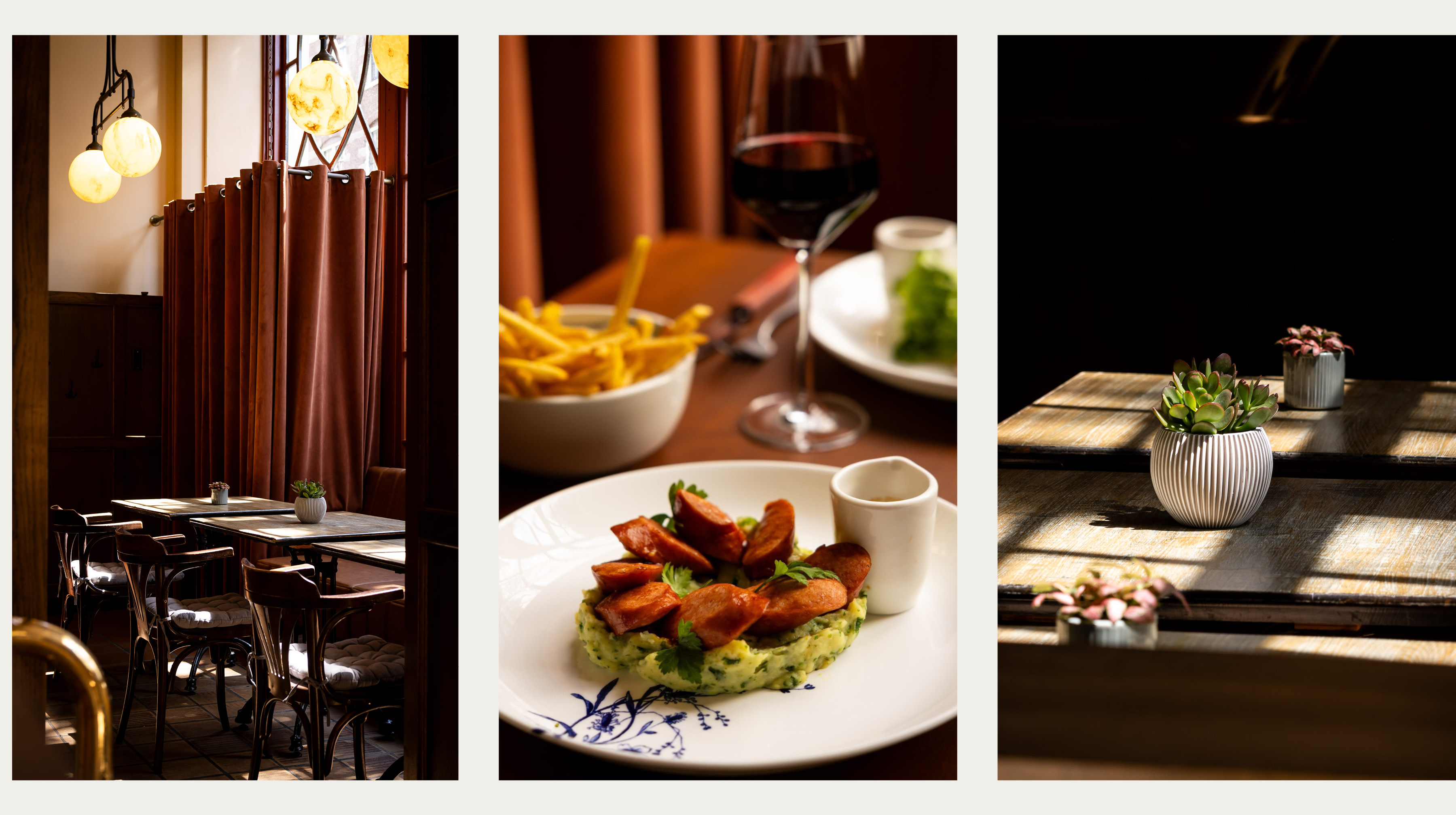
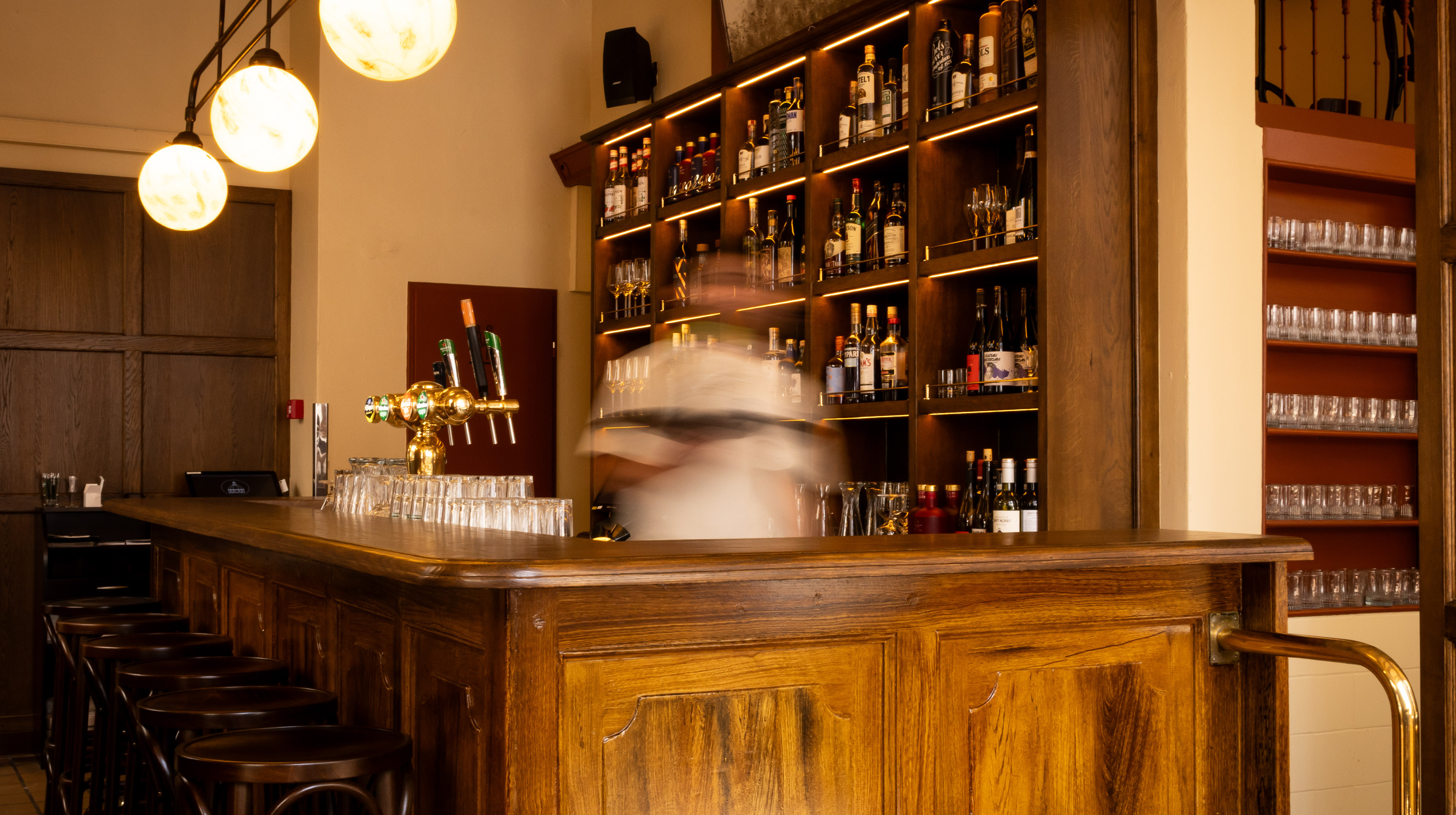
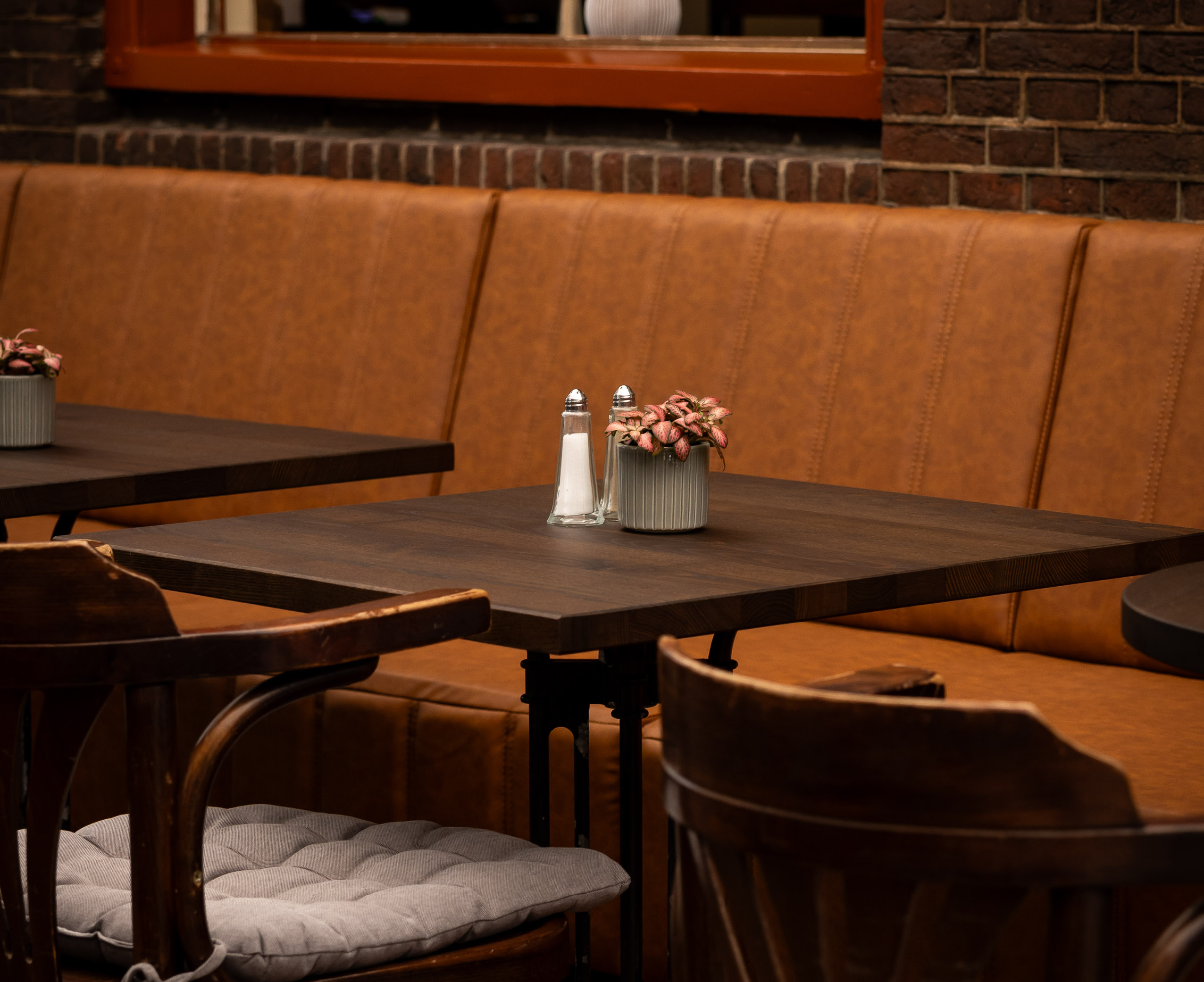
The interior reinforces the character of a classic neighbourhood café. Warm wood tones, leather banquettes and marble tabletops create a timeless setting, while brass details and globe lighting add a subtle sense of elegance. The long wooden bar becomes the social heart of the space, inviting guests to drop in for a quick coffee, lunch or an evening drink.

Koepelcafé reconnects with its original spirit: an authentic Amsterdam café with a contemporary identity. A welcoming place on the corner where neighbourhood life and hotel guests naturally come together.


